Sunday, September 23, 2012

Support Small Paint Business...


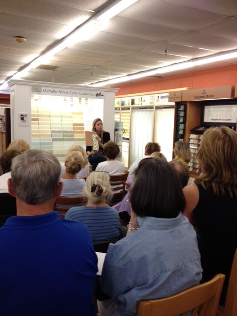
Hello all! This week was an exciting week because I was able to go out on the road and speak about paint and color in Massachusetts.  During this visit, so many people had paint and color questions, and it was so great to be able to get the message out about how color and good paint can completely transform your space, but more importantly, why all paint is not the same.
   This brings me to the topic that so many of us in the paint world are beginning to see, and that is the support of the small business that is so needed in this country.  We see commercials on TV all the time for the bigger companies like Benjamin Moore, Sherwin Williams, Behr and Valspar to name a few.  While we know that their products are good, we also know that they are mass produced and they are not a company that has a face to it.  They are all corporate giants who do not take into the personalization that color can have in ones home.  They sell you tons of colors on their displays, but never took the time to really have a conversation about how any of this works.  They do not get that this process of design can be a complicated one that takes time and thought.  They think that more choices is a good thing, and the reality is that it is total confusion!
   One of the ways that Muralo and the Michelle Winick Color Collection is set apart from the rest is that there was a ton of time and thought that went into everything color.  The colors were made to work in the product, and it was a formulation that was done with color and product quality in mind.  The Muralo company is very proud of the technology they have, and their product backs that up.  Whenever I refer the Ultra product to someone, they fall in love with it instantly because they see its exceptional quality.  When the MW colors go up in a space, people understand that every color has a unique balance to it, something that the mass produced collections of color to do not have.
   Next time you are looking to purchase paint, think about the options you have.  You can support the company that works hard for the customer, or the one that mass produces its products and does not work for the consumer! Just because you may not recognize the name does not mean that the quality is not there.  Trust me, I would not put my name on the product if I did not know it was the best!


Happy Painting!

Sunday, September 16, 2012

Dear Benjamin Moore...

Dear Benjamin Moore,
   My passion for color and paint is what I have used to create a niche for myself in the interior design world.  I have been able to explore the paint world in a huge way for the past few years by having a designer color collection with the Muralo paint company.
  When I first started the color collection, I had a vision of it becoming the "go to" palette of colors for homeowners, designers and contractors to take the headache out of choosing color.  I also knew that when creating these colors and the combinations of the palettes, that it was going to be a way to take out all the unnecessary colors that many paint companies put on their color displays.  What I did not envision was creating this tool for you to color match into your paint, and then getting complaint's from those people who purchased the "knock offs".
  While I did not reinvent the color wheel, I did establish a palette of colors that have very unique qualities to them.  The MW color collection is composed of colors that are very soothing, and have a fresh, clean look to them. When you see them fully painted in a space, you understand why people say they are different than other colors on the market.  They have a look to them that makes them look as though they are made to specifically go into the environment they are in.  It is not only the colors that gives them this aesthetic appeal, but it is the paint that gives them this look as well.  Muralo's paint has a look to it like I have never seen before.  Everyone who uses this color collection understand's what I am talking about.
  Over the past few years, I have had to deal with the reality that the paint world steals each others colors, not realizing that they are just trying to recreate what has been made for a specific product.  Benjamin Moore specifically has told homeowners, designers, and everyone else that you can get great color just by color matching other lines of color into their paint, and this has created mass confusion for everyone.  We also have seen an industry that has confused everyone into thinking that a brand describes the quality of paint, and it is simply not true.  Yes, you make a good can of paint, but you are not the best at everything.
   The Muralo company has been around since the late 1800's and they have focused on technology to always produce a high quality product.  Muralo is not owned by a billionaire (Warren Buffet), and does not get to advertise at the Yankee games, or on TV regularly.  They are a small business that works hard to make great paint.  For many years they have spent their money on research to create paint that is known to industry professionals as some of the best paint they have ever used.
   Now Muralo has something going for it that they have never had before-COLOR! And this is color that has been specifically formulated for THEIR paint, not Benjamin Moore...  This means that they are mine and Muralo's colors, and this is why they look the way they do when people choose them-because they are custom made for Muralo...
   The MW Collection color tools are the best on the market.  All the color tools are hand made using REAL paint, something that has never been done before by Benjamin Moore.  These tools take hard work and care, something that this small business is very passionate about.  I also created verbiage on my fan deck that somehow ended up on your fan deck? I wonder how that happened? We seem to work in the same neck of the woods...
   The most amusing story I heard recently was a Benjamin Moore worker calling a local NJ paint store asking why Muralo has these colors, and the question was "well what am I supposed to do to get these colors"? It was as though we hurt their feelings by creating something they could not get their hands on.  She went on to say that she would be creating formulas to match the colors, and then sell them in Benjamin Moore paint.  This seems like stealing to me...!
  If you choose a shirt, do you go up to the cash register as ask if they can make it in another brand??  I don't think so...So why is paint any different?
  I am going to list the many ridiculous questions that I have been asked about Muralo paint since I started this color collection, and I know that you may laugh reading this, but YES, these are real questions I have been asked, and most of them by seasoned Benjamin Moore users.  It seems like they will use any excuse to blindly stay loyal to their brand...

1. Does the paint work like Benjamin Moore, meaning you can roll it and not see roller marks?
2. Does the paint adhere to the wall? I know Benjamin Moore has good adhesion, and I do not know if Muralo works the same way.
3. Will the paint fade.  I know Benjamin Moore never fades?
4. Is Muralo a brand of Benjamin Moore?
5. Will it peel off the wall?
6. And this is my favorite.  Why aren't you using Benjamin Moore? "I have never used anything else".

Yes, these are real questions from painters...
Now, I am not going to dignify most of these with a response, but I am going to say this.  The Michelle Winick Color Collection colors are MURALO colors.  They are not Benjamin Moore, Sherwin Williams or Behr colors or any other paint colors.  They are exclusive to the Muralo company, and they cannot be matched! If you choose a color, then you should use the color as it is made.  When you match it in another paint, it is no longer the color, so you might as well just hope it works now...
  My message to Benjamin Moore is this..."I don't steal your colors...Stop stealing mine."  There are plenty of walls for everyone in this world.

Yours Truly,
~Michelle Winick


Sunday, May 13, 2012

Color Matching Simply does not cut it!


    I am inspired to write this blog because I received a letter from a consumer that told me a very common story of what happened to her when she had her room painted.  She went into the paint showroom and chose one of the “Michelle Winick Color Collection” colors to paint her bedroom with. She chose the color, and  told her painter what to purchase. 
    This email was written to me because she was frustrated that my color did not match the swatch she chose from,  and she wanted to know if there was something that could be done (like get reimbursed for the paint perhaps?)
   I told her to do her research and grab the paint gallon out of her garage that was used and take a picture of it to send me.  Sure enough, it is labeled as one of “my” colors, but a color match of it.  It was in a different brand of paint, hence not making it a “color match” one of my colors.

    When I created my color collection, I knew that the knocking off of colors would be something that is a fact of this business, and I could never do anything about it.  Company’s make colors and samples for their colors based off how the color looks when they create it.  That is the main reason why the color chips in my color collection are made with real paint. When you “color match” it may be close, but the final result is not the color you originally chose.   It is not authentic.
    The paint industry seems to think that advertising color matching is a way to sell paint, but I think it is irresponsible advertising message to the consumer that does not know any better.  When a company says that they can match any color, what they are not telling you is that the composition of the color is completely different when they do a “color match”.  Do you think that they will back it up when it does not look the same on your wall as the original color you chose? Absolutely not. It is technically a match, it just doesn’t look the same, and there is a big difference between the match and what the authentic color you choose will look like.  
   I have worked many of hours tinting my colors for the collection, and when I do this, there is a lot of math involved as well as trade secrets that I have been fortunate to have learned over the years I have been in this business.  I choose which colorants I want to go into my colors because I know the way the light changes the colors based off of how the color is formulated. The colorants that go into it greatly impact the overall appearance of the paint color.  
    Authenticity is important when making any purchase.  Just like choosing a piece of designer clothing, or a fine bottle of wine, knowing how it is made is very important! 
  

Sunday, February 26, 2012

Paint and color matters when looking to sell a home

Today my husband and I were out looking at open houses, and it inspired me to write this short blog for anyone putting a house on the market.  
    The first thing that every home owner should know is that paint is the easiest thing to change in your home, but the reality is that the cost of paint and labor is going up, so this can be more of an expense than people realize.  
   This is where good paint and colors come into play.  If you are looking to sell your home, or if you are a builder or real estate agent, I think it is important to bring up the topic of paint colors and paint quality.  While I myself can look past it and know that it can be fixed, a lot of people cannot.  
  I was inspired to write this blog because even I had a hard time looking past this particular house I saw today, mainly because it was a new construction, and it looked like it had been painted a decade ago.  What I think threw me off more than the poor color choices, was the lack of quality in the paint.  In a house that is considered to be brand new, you should not have cracked, sagging paint on every surface of the home.  It took away from the beauty of the moldings and spaces because the surfaces were done with such poor quality.  I would now need to consider painting ever inch of this house, not to mention doing the prep again because of these low quality products when looking at my budget.
   While beauty is in the eye of the beholder when it comes to color, when it comes to the quality, that is a whole other story.  The best advice I can give is that just like with everything else in life...you get what you pay for.  Do not believe that "paint is paint" because it is completely untrue.  It really does matter on the overall appearance of a house, and it is worth every penny to purchase good quality paint for a job.
  Check out the Muralo Ultra "the creme dela creme of paint" as I like to call it.  And for an eco friendly product check out the Muralo BreatheSafe.  You will be happy you used quality products when you see your walls and trim sparkle with these products.  And the colors from the Michelle Winick Color Collection will allow your spaces to feel clean and fresh, with a touch of elegance and sophistication.
   Happy Painting!
   

Monday, February 6, 2012

Can the type of paint you use change the way the colors look in the room?


Q. I am looking to repaint rooms of my home, and I want to see if you think the type of paint I use can affect the color.  I have been sampling colors, and the paint store mentioned the color can change when I put it up on the walls because they are different paints.  What does this mean?


A. This is a great question because this is a topic that a lot people do not speak about or know about.  Color sampling is tough when you are not sampling with the paint you are ultimately going to use.  Product and sheen can alter the way a color looks.  Sheen of paint will change the way the color reflects on the wall-the higher the sheen, the more the light will reflect off of it.  The color can even look lighter when you have more of a sheen.
   When you are sampling colors and buying sample pints, they are usually made with eggshell.  You may end up using a matte or flat on the walls, so you want to be aware of that once you finalize a color.
  The quality can also make a color look different.  A good quality paint will make the color look cleaner and richer.  An inexpensive paint can look muddy because the make up of it is different (I could get into the technical aspect of it, but it is not necessary).  I have had clients painters use contractor grade paint, and then notice that the colors do not look as good.
   This is something that everyone should be aware of because it can be the difference that makes or breaks a space.  Always check that your contractor is using a high quality, durable paint, such as the Muralo Ultra used with the "Michelle Winick Color Collection".  It is necessary not only for the quality of the job, but to make the colors in the space look fabulous!  Happy Painting!

Wednesday, February 1, 2012

A question from a homeowner on choosing colors for a new construction


Q. I am in the process of building a new home, and I am trying to choose colors for every room of the house.  I picked up the fan deck from the Michelle Winick Color Collection, and the story boards with the color combinations, and I wanted to see what you recommend for a home with nothing but some tiles and cabinets in it? We do not have any furniture chosen yet.  Where do I begin with color choice? What products are best for me? My children are young, and my current homes walls are a mess! Any suggestions you have will be greatly appreciated!


A. Congrats on building a brand new home!   I work on a lot of new constructions and spec homes, and that is how I came up with the concept of the color collection-using usable, sophisticated colors that bring out the elements of all homes-stones, tiles, etc.  The best thing to do is choose paint colors that allow you to bring in color with furniture later on.  My recommendation is to start with the common areas, and then work your way out into the other spaces.  A safe bet is to keep the foyer and hallways (common areas) a neutral color, and then branch off into other colors.
    Start by choosing a color a palette you are comfortable with (mainly decide if you prefer browner neutrals, grayer neutrals or neutrals with a warmer tone).  If you are bringing in a granite or stone in the kitchen that is predominately beige/brown, the neutrals are the best place to start.  (MW-1, MW-2, MW-3 and MW-6 are usually tones that will be in a granite).  If you are bringing in lets say a carrara marble with gray tones, then start with the serenity and earthy palette (MW-15, MW-16 and MW-21 are all great grays from my color collection).  The warmth collection is great for warmer accents.  Now that you have a color palette that works with the bones of your house (stones, tiles, etc), start to bring in deeper tones in those palettes into the living room, family room, etc.  Those spaces are also great to keep somewhat neutral so you can bring in fabrics, etc.later on.
   Once you have your palette for those spaces, start to bring in accent colors (greens, blues, etc.) perhaps into powder rooms, dining room, study, office, etc. Allow the palettes (neutrals, serenity, etc.) in the collection to guide you. The palettes of your choice will work together in harmony throughout your home from room to room.  And don't forget about the coordinating trim and ceiling colors.  Those trim and ceiling colors are what tie the whole space together!
  Now as far as the paint itself is concerned, the Muralo Ultra is the "creme dela creme" of the paint industry.  The Ultra Matte would be my recommendation for the walls.  It is a durable finish, yet flat enough to hide imperfections in the walls (especially in new construction where nail pops and settling will occur).  It is also scrubbable for those little fingerprints!  For the trim I suggest the Muralo Ultra Semi-Gloss or Satin.  The semi-gloss will be more of a shine than the satin, and that is just a matter of preference.  For the ceiling, the Muralo Ultra Flat is the way to go.  It is a dead flat, which is what you want for a ceiling to hide any imperfections due to the house settling, etc.
  Good Luck and Happy Painting!

Sunday, January 22, 2012

Question of the day..."Which paint is right for me?"


"What kind of paint should I be looking for?"
 When I ask a homeowner what kind of paint is going in their home, they just tell me the brand, but do not know what line it is within the brand.  This question then this leads to this discussion...
     I often consider myself an advocate for homeowners when it comes time to make this investment into their home.  I always explain what is on the market, and just because a good brand name is behind the products, it does not mean that it is right product for you and your home.  Just when you thought choosing the color was the hardest thing, choosing the product can be just as tricky!
   How do you know what is right for your home and lifestyle?  Terms like-low VOC, zero VOC, eco-friendly, Green Guard, natural, earth friendly, high durability, scrubbable, etc. are some of the many things you hear, and the list goes on and on!  Every company has their different grades and lines of paint, and your job is to figure out which one is right for you.  You want to consider the quality and durability of the product on the top of your list.
   With all that is changing in this growing industry, how is one to keep up on this information and know what they really want and need?  I am going to give you a short guide to choosing what is right for your home when you are getting painting done.  Keep in mind that when doing the painting in your home that it is your house, and you want to know what is going in it. Do your research because you are the one that is paying for it, and living with it for years to come!

1. First have an idea of the colors that you are looking to use for the walls, ceiling and trim.  The "Michelle Winick Color Collection" gives you the guide to many of today's color trends and color combinations.

2. Once you know the tone of the color (light, medium, dark), you can then choose the sheen you prefer-flat, matte, eggshell, satin, semi-gloss or high gloss.  Keep in mind that the higher the sheen, the more imperfections will show up when the painting is complete, and the higher the sheen, the more durability the paint has.  Darker colors on the walls also hold up better when a matte or eggshell is used vs a flat paint.
  2a) Typically Flat, Matte or Eggshell are the best for walls, Flat or Matte is best for the Ceiling, and Satin or Semi-gloss is best for trim.

3. Now that you have color and sheen, you want to determine what type of paint is best for you.  Some things to take into consideration are "do you have children or pets?",  "are these spaces high traffic?", "do you have allergies?".

4. For spaces that have children, pets or traffic to contend with, you want to make sure you use high quality paint for those areas with some sheen to them (Matte or Eggshell for the walls would be best!).  Believe me when I say that you will thank me later when you splurged the extra $20 for the gallon so that in 5 years your room still looks like the day you painted it!  The Muralo Ultra line from my color collection is the winner if you answered yes to any of these questions.  It is what I call the "creme dela creme" of all the paints on the market today.  It is Green Guard certified which is a bonus with this product, and it is self priming when going over a clean, previously painted surface.  I have rooms in my home painted with it, and it is fantastic!

5.  If allergies are something that are of serious concern to you, you will want to look into the Muralo BreatheSafe line.  This is a zero VOC product that has been created, and the quality is also great.

6. Next, make sure that you make a clear list of everything you want when you or the painting contractor go to the paint store.  You want to make sure you list the color, brand, line and sheen. (ex: MW-1 Ivory Stone, Muralo Ultra Matte).

7. Keep good records on what you purchase so that if touch ups are needed, you can always refer back to your list.

Happy Painting!

Thursday, December 22, 2011

A question about decorating a Master Bedroom with a gray


Q. I am decorating my new master bedroom. I want a room that is very sophisticated with clean lines, but still feels warm. I have dark furniture-black/brown wood, and I would love to incorporate a gray in the room either on the walls or accents.  I am looking for ideas on wall color, blankets and sheets, decor, rugs, etc.

A. My suggestion is to work with the gray as the wall color, and then bring in accent colors with the bedding, window treatments, rugs, etc.  Gray is the type of color that needs to work with everything in the space or it can feel a bit industrial.  When I created the grays in my color collection I made sure that they have a browner undertone so that they would work well with accent colors, and not come off looking too pink, blue or green.  For the walls I would recommend the MW-16 Rain Drop, and the trim and ceiling I would recommend MW-41 Glowing White.  For accent colors, I would consider bringing in eggplant purple and a rust tones as one option, or for a more serene type of feel bringing in blues and chocolate browns.  Also work with texture in the space, and consider bringing in vases or artwork that gives you small pops of color.  Sometimes less is more when bringing in accent colors! Good luck and Happy Painting and Decorating!

Monday, December 19, 2011

In these times, support the local paint stores!

Eagle Paint and Wallpaper, Englewood NJ

I am writing this blog because I found myself in awe when I went to a home center "box store" over the weekend and watched people purchasing paint.  I started to listen intently to what type of advice was being given to the "do-it-yourselfers" and I was a bit taken back.
   I will start off by saying that there will probably be some disappointed people that will be coming back complaining after they brought home their paint.  There was one women who caught my attention because it looked as though she was making a substantial investment in these products and she was trying to educate herself on how to apply this paint.  What struck me as odd was that she had sample boards that she was matching that she had painted herself.  (The one thing I can say in this industry that needs to be changed is the notion that you will always get an exact match when color sampling.  It is not always true, and I believe that this is a perfect example as to why it can be a bad idea.  That is for another blog entry...)
   I watched the employee take her painted board to put on the computer to read the color, and he did not even check the formulation.  Then the next question was, "Do you plan on doing one coat or two?" This is not a question that a seasoned professional in this industry should every ask! Her response was "I did not know I could do just one coat, but you would know better than I do".  Then he said "Well, you will use less paint with one coat, and since it is a lighter color, this paint should do the trick". The paint he tinted was a lesser quality gallon of paint-I will not mention brands because I do not want to offend anyone.   This woman probably thought she was getting a deal which is why she went to the box store in the first place, but now she will need more paint because there is no way it will ever cover in one coat, and in a year it will probably need to be repainted because that paint will never hold up on the wall.
    When the man took the gallon out of the shaker he did not even test the color.  He just handed it off and said "next in line...".
    This women spent her valuable time making this sample, and then trusted that it would come out exactly the same when switching brands.  Why would she not trust this? They are the professionals, right?
  Not only did she take the time to make a sample board to approve her color, but she also asked about the procedure as well as took the time to try the paint out before using it on her wall.  Now she does not know what color she got, and the product is not even the same as she tested out.
   I wanted to take her aside and send her to the local "town paint store", but the damage was done.  This is probably something that is happening every minute in this industry, and it is a shame.  People do not know what they are purchasing, and this is not like a shirt that will be worn a few times, and then sit in the closet.  It is a material that will be in their homes for years to come.  It is the overall appearance of the walls when you see your space every day.  I hope for her sake that the color matched, but something tells me that it did not, and she will end up repainting this space, wasting time and money, because of the careless procedure of the box store.  Not to mention that she will be back to purchase more paint for sure and probably end up spending more money.
    The moral of the story is this.  Shop local paint stores, and support small business. The type of service and products you get will be worth every penny, and the advice that you receive should be worth everything when your space looks fantastic in the end. Good luck and Happy painting!

Sunday, December 18, 2011

Answers to your paint color questions...

Hello Everyone,
   I am always getting questions about paint and color, so I am starting to answer the questions in my blog for everyone to see.  If you have a question, send me an e-mail at mwcolordesign@gmail.com.  You can view all of the colors in the "Michelle Winick Color Collection" on my website http://www.michellewinickdesign.com/index.php/color-collection/color-collection/
Happy painting everyone!


     Q. I am looking for the perfect living room color that will fit my mood for all seasons. Our sofa is ivory white.  There is lots of light in the room and the trim, built-in bookshelf and the fireplace across from the sofa is white. We will be using a natural colored jute rug on the floor so our options are pretty endless.  Also fyi, the one color I would not like is a green.  Any suggestions for a soothing, livable color would be great! 


       AYou have so many options for this space because of the neutral tones that you have with the furnishings and the rug.  My suggestion is to bring in a paint color that compliments the spaces elements, and makes the neutral pieces stand out against the walls. I would recommend bringing in a blue-gray into the space.  This type of color will work great with the natural color of the jute rug.  It will pop against the white built in, and still work great with ivory sofa.  Since you are incorporating a white and an ivory, you need a color on the walls that will work with both.  Take a look at the MW-14 Ocean Rain for the walls, and the coordinating trim and ceiling color MW-41 Glowing White.  This is a combination that will give you timeless color, and will work on a winter day or a summer evening! Good luck and happy painting!

Sunday, December 4, 2011

Paint colors can change your life!


A paint color in a room can change the way you feel every time you walk in that space. People are effected by the design all around them, and the color surrounding you will change your mood whether you realize it or not.  The way you feel physically and emotionally has much to do with the color. If you are happy in a room in your home, then it will make you feel better when you are there.  
   When I work with clients, I try to convey the message that your home should be your oasis.  Everyone will have an opinion of how they want your space to look, but YOU are the one that needs to love the space you have.  While we may all have things that we want to change about our home, we all deserve the right to love the space we live in.  We can all use paint in some capacity to change a space, and create a space that we can call "home".
  This is why I love what I do every day.  I get to bring something into peoples lives that can make them happier.  How many people can truly say that about their jobs?  In this economic climate, we are not all privileged enough to make costly improvements in our homes, but most of us can still afford paint.  You may be reading this article right now sitting on a sofa that you wish you could replace, or a kitchen that you want to rip out, and that will cost thousands of dollars.  We all sit and wonder, "What if I had the money to change this room in my house?".  The answer is that you can do that with just a few gallons of paint.
   In traveling throughout the East coast meeting paint dealers that are taking in my color collection, I have been able to get feedback from all different markets.  Some areas are considered to be areas where certain brands of paint dominate the shoppers that walk into a store.   They sell a great illusion with the pictures they put on their displays, or the advertising they do saying they are the best, but did they create something that is meant for a homeowner that is not a designer and does not have all the knowledge that they do about color?  The educated consumer is willing to look beyond brand name labels and see an innovative product that is not only selling a different kind of color appeal, but a brand that stands behind quality above anything else.  At its core, that is what the "Michelle Winick Color Collection" is all about.
  I was inspired to write this particular blog because I got a phone call from a person who listened to me speak passionately about paint and color a few months back.  This was a person who came to my seminar as a way of getting some information, and left with something invaluable.  He left with the opportunity to make his house his "home".  I explained to my crowd of about 25 people that day that I have not only created "paint colors" but something that has the power to change an environment.  I went into my seminar looking to educate the people that came to listen to me speak about color, and left with an experience that has changed the way I look at this palette of colors that I have created.  I have learned that this goes way beyond just a gallon of paint that someone puts on their walls.  It is a lifestyle, a feeling, a mood, an emotion that changes how one looks at their space.  The fact that a paint color can do that is remarkable.
   I urge everyone that is looking to repaint a room or a whole house to "think outside the box" and look at a palette of colors that has been created to make your space "color perfection".  A harmonious palette of luxury has been created for you, and only you.  YOU are the one who determines the feeling you want to come home to every day, and you now have the opportunity to do this will just a few gallons of paint.
   The "Michelle Winick Color Collection" is something that came from the need for usable, livable color in the paint industry. The collection has now developed an amazingly loyal following by the people that have experienced it in their homes.  I never thought when creating this palette that I would be told "if your color collection did not exist, I would be in therapy trying to put this entire house of colors together myself".  While we all know this is an exaggeration, we can all appreciate that our time is valuable, and when your get stuck in details of a project that become too hard to finalize, we could all use a coach in that field as a way to allow us to feel confident that we are not making a mistake.
   I leave this blog with this quote.  "There is no better feeling than loving your home, and paint can help you to achieve this goal.  Let your walls glisten, and your home sparkle."

Sunday, August 21, 2011

Is Gray the New Beige?

   Gray at one time may have been considered to be cold or boring, but it is becoming the "go to" color in todays design trends.  Gray is officially the new beige...
    Gray is a color that is being incorporated into today's paint color trends in a very big way.  I am seeing clients request grays almost on a daily basis. Gray is a color though, if not chosen correctly for a space, can really fall apart when it gets on the walls.  Grays flip around more so than any colors, and it can have many different undertones in it.  I have seen grays look blue, green, or purple, to name a few. There are a couple of ways of avoiding this situation.  It is one of those colors that look so beautiful when done correctly, but can be a disaster if one of these undertones sneak through.
   When gray is viewed alone, is can look flat or dull.  In order to give it its flare, it must be paired with the right ceiling and trim color.  It is a must that a clean white is used with a gray on the ceiling and trim.  If you pair a gray with a warmer white that has a yellow undertone, it can turn the gray into a blue/violet.  If you pair the gray with a redder white, it can turn the gray into a greener gray. The gray and white combination is a classic, clean sophisticated look.
   When I formulated the colors in the "Michelle Winick Color Collection", I did quite a bit of research on the gray family.  I was mainly concerned with the tones of gray that people were bringing into their spaces.  I was seeing quite a bit of white carrara marble being brought in, and other marbles that had gray veins in them.  It became apparent when I saw 4 houses in one week putting all of the same white carrara marble in bathrooms, and that made me realize that this gray trend was here to stay.
  One of the ways I found the "perfect gray" was by studying these stones.  I wanted to see what tones I could pull from them to give me the most natural feeling gray.  What I came up with was MW-15 Morning Fog, MW-16 Rain Drop, and MW-21 Stone Mountain.  These 3 grays I considered to be my "gray perfection".  The key to these three grays was MW-41 Glowing White and MW-25 Crystal White.  Both clean whites that worked beautifully with these grays on ceiling and trim.  Putting these combinations of gray and white together is absolutely awesome.  I have seeing the spaces painted and they are magnificent.
   I also figured out a way to incorporate a beige tone (that will never go out of style) with the grays that coordinates beautifully.  MW-6 Fine Silk became the perfect transition neutral beige tone to the grays in my collection.
   Following these color trends has allowed for me to put out colors that you can trust.  These color combinations have been proven to work time and time again...
 

Tuesday, June 21, 2011

Paint is the least expensive way to decorate. Just don't go cheap on the paint!

When I go to a color consultation, the first thing that comes to mind is giving my client the best quality paint.  They are calling me into the job for my expertise right?
   It seems these days that people are always looking to save a buck, but are you actually saving money when you but a less expensive paint? The answer is no! Here are the things that people should consider before they start painting their home.
   One of the main reasons that people choose to paint over perhaps buying new furniture, or redesigning an entire space is because it is the least expensive way to decorate.  When you are having a painter come in your house you are going to pay for the labor regardless.  The difference between good paint and cheap chalky paint is only about $15 per gallon.  So if you are going to be using 30 gallons of paint that would be about $450 difference.  Over the average lifetime of a paint job (approx 6-7 years) thats a minimal amount of money. Would you spend more for a nicer quality piece of clothing that may only last you one year? Absolutely! So why go cheap on paint?
   One of the main reasons that I have been so comfortable with specifying the Muralo Ultra which is the paint used for the "Michelle Winick Color Collection" is because I know it is top quality paint.  It is one of the best selling points to the color collection.  The painters that I have introduced to it say that it is now their product of choice.  It covers great, and it looks amazing on the walls!
   You want your paint job to last for years to come.  When your children or pets touch the walls, you want to know that you have a durable paint on the walls.  The cheap paint does not hold up as well, and then in a year you need to repaint the entire wall.
  Colors also looks better when it is made in a higher quality paint.  You do not achieve the depth of color as nicely in a cheaper line of paint.  It tends to look hazy, which in turn makes the walls look not as clean.
  I constantly run into painters and homeowners that are trying to cut corners and go with the cheap stuff.  While it looks good at first, I promise that it will begin to show its age very quickly.
   The last piece of advice I have is for a homeowner who is getting a painting estimate.  Look into what kind of paint is being purchased if the contractor is including the paint in the price of the job. Even though they may say that they are using a Benjamin Moore or Sherwin Williams for example, there are different lines within the brand that are not good quality.  They are contractor grade which are not made to withstand everyday traffic.  This is something that homeowners do not realize until its too late.
   Do your research and always know what you are getting before you begin painting your home...

Saturday, June 4, 2011

What is the "Michelle Winick Color Collection"? Who is Michelle Winick?


Hello Everyone,
   I am new to blogging, so here it goes.  I am an interior designer and color consultant in the NJ/NYC area that has partnered up with the Muralo Paint Company to create the "Michelle Winick Color Collection".  This color collection available through various paint dealers in North Jersey. It premiered in Eagle Paint and Wallpaper in Englewood NJ, and is in Ricciardi Brothers in Paterson and Morristown NJ.  It is also available in the Ricciardi Brothers store in Parsippany and Harding NJ, but you will not see a display in the store at the moment.  You can also look at the colors on my website www.michellewinickdesign.com and click on the color collection tab.
   Before I go into what this is, I want to explain to you who I am, and why I have created this color collection.  I am an interior designer that was always looking for ways to make my clients lives easier when it comes to making decisions, especially when it comes to choosing color. My clients are smart, sophisticated people that are looking for practical and functional design.  They are also people that are coming to me because they may know exactly what they want, but do not know how to execute what they are looking for.  I have spent my time in consultations over the years not only looking at spaces, but listening.  I have walked into some of the most luxurious homes in Bergen County NJ, and I have seen just about everything. I have listened intently to what people have to say about color, and I have learned that people are looking for simplicity, and clean fresh color.  Generally speaking, my client is not someone that is looking to paint their kitchen hot pink or lime green.  They are looking for livable color, but also accents that make a statement.
   I have always been a designer that wants to make a statement with color, but in a subtle way.  I go for the wow factor, but I do not want the "wow, what were you thinking?".  I listen to what they want, because it is their home, not mine.  I do walk into every job and treat it as important as if it were my home, but I take into account that they are living there, not me (although some of those homes I wish I was living in : ).  I take lifestyle into consideration, as well as what may be existing in their home already to help guide me into what type of palette they will be wanting.
   A few months ago, I began the process into creating this color system.  I see it working every day in the field.  I wanted to be able to share my energy, and passion for paint color with people, and I knew the only way to do this was to create this palette of colors.  I am a firm believer in three things.  One: paint is the cheapest way to decorate, and it is the best bang for your buck.  Two: the ceiling should be considered the "fifth wall" in a space.  Three: Paint color can make or break a space.  The wrong color makes the whole design concept collapse.
   What has made this venture so interesting is creating this color system from the ground up.  I have created a system of colors that I know to be the "go to" colors that people are looking for.  I designed the color display rack that is in the paint dealers showrooms.   I micromanaged every single color to perfection.  I spent countless hours by the paint tinter tinting these colors to make each formulation for every color.  I created a fan deck, and cut the fan decks, and labeled the fan decks.  I wanted to truly know this color collection, and it became a part of me.  This may all sound a little crazy, but this is who I am.  I am a perfectionist, and I knew that the only way to make this color collection successful was to be involved in every detail and aspect of it.  Every swatch that is made (on display and in the fan decks) is hand crafted.  (That I must thank Mel for doing.  He is amazing for making these color cards, but that is top secret on how those are made!)  I know that the product and colors that I have put out are top quality, and that was the most important aspect of this.  Top quality paint, and top quality color.  Muralo Ultra Paint is one of the best paints on the market, and I am not kidding when I say that it is magical when it is on your walls.  The colors are well balanced, and then just melt into your environment.
   Many designers have told me that they have colors that they know work, and for good reason.  These colors match popular stones on the market, marbles, travertines, etc. to name a few.  They are also colors that allow for people to add decor into their home without the paint color dictating what they choose.  These colors make sense as livable color to put into a home, and have a sophisticated essence to them.  Simply put "these colors really work in an environment".
   I am not claiming to have reinvented the color wheel, I have just renovated it.  People walk into a paint store and are barraged by color swatches, and color samples, and they usually walk out of the paint store with something completely different from what they had hoped to find.  The color chips in my color collection are a generous size (9x12), and what makes them unique is that they are made with real paint!! This may not sound important, but believe me, it is.  Evaluating color is done best when you are looking at the real paint. The color cards that you get for free in the paint store are representations of the color (and are made with ink).  When you look at the real paint, you can see how the color reacts to the light, and see the true color.  There are also coordinating trim and ceiling colors that work with every color.
  As I go on with my posts on this blog, I will go into why this color collection will work for your home (I am not saying that you will find every color in this collection, but if you are looking for clean, fresh color, you will find it here).  I will also explain why using quality paint is an absolute must! Cheap paint will cost you more in the long run, believe me! I have seen even multi million dollar homes painted with cheap paint, and then need to be repainted a year later.  It isn't worth it.
  If you follow my blog, you will begin to see my passion for paint and color.  I love every phone call I get from a client after the paint job is done.  I have heard terms like "magical", "color perfection", and "simply beautiful" to name a few.  I live, eat and breathe color.  It is who I am, and what I do, and I want to share this with all of you.  Embrace the world of design and color, and allow my color collection to bring color and beauty to your home.